
Exploratory Data Analysis of SAT scores

As an introduction to exploratory data analysis (EDA) I was given a csv file of SAT scores. The objective was to load and find insights into the data. The first step was to read in and condition the data if necessary.
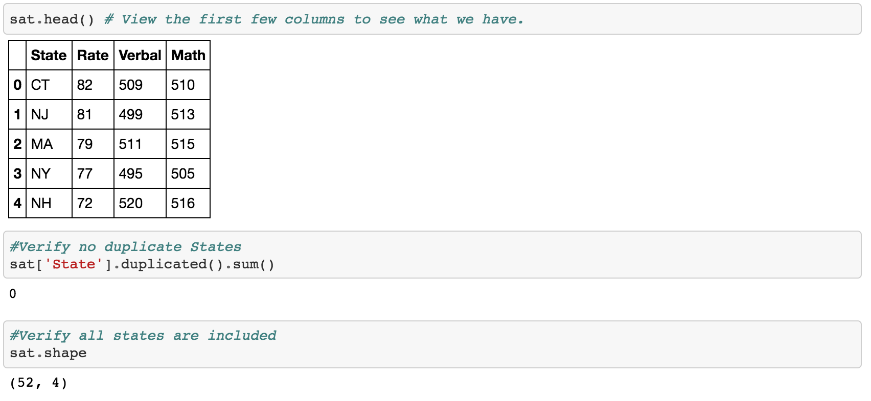
After reading in the data it looks like we have Math and Verbal scores for each state. Then we have a column called ‘Rate’ which I assume is some sort of ranking system. Something that is not specified is the period of time.
One problem I can see is that there are 52 states. Last time I checked there were 50 mainland states plus Hawaii. Turns out there was an additional state called ‘All’. I went ahead and removed this row.
Since the data set is not so large we can utilise seaborn’s pair plot function.
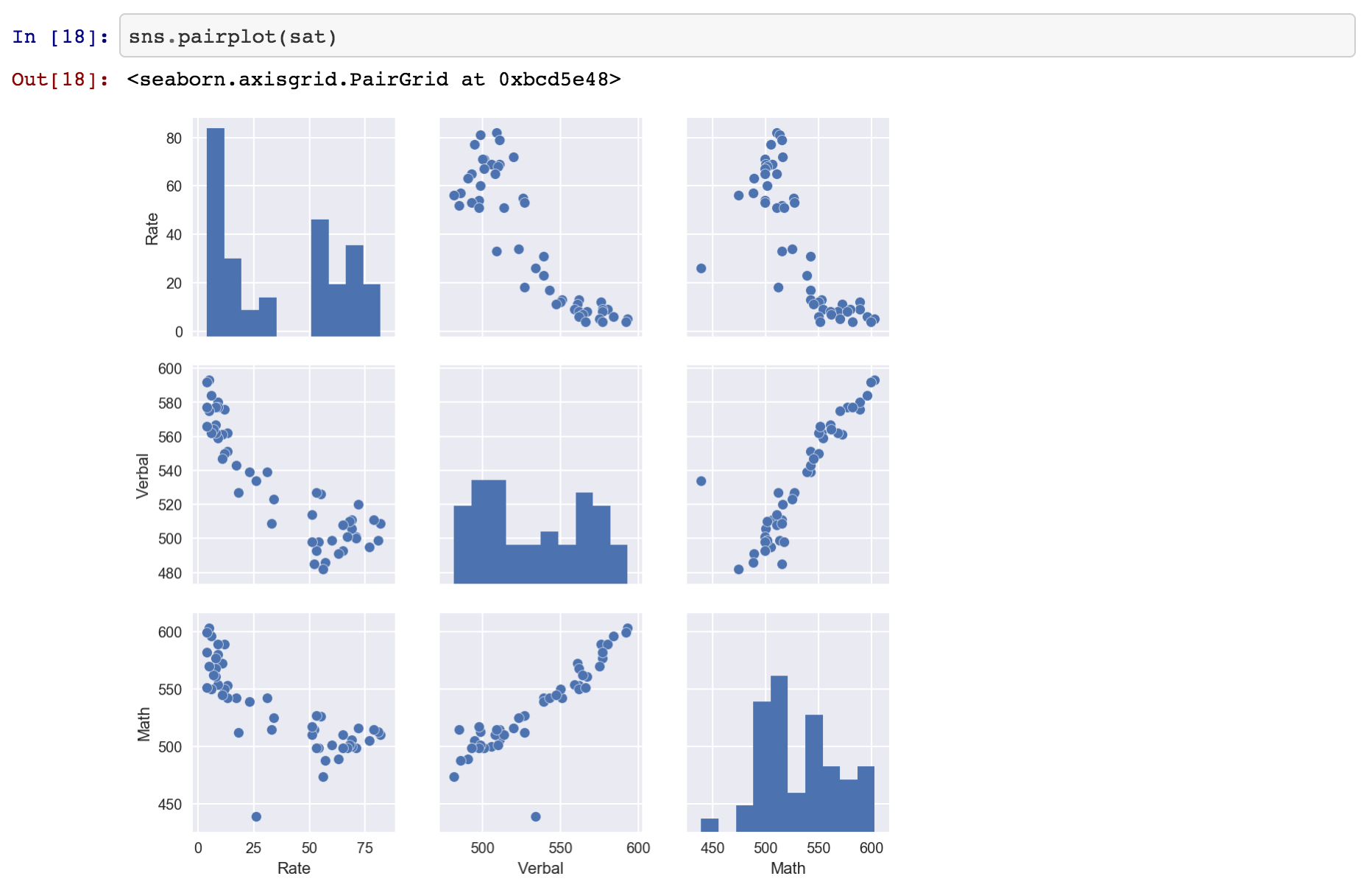
Let’s discuss the histogram’s first. A quick view of the histograms tells us that all the distributions are binomial. Another possibility is that there is not enough distribution in the data. This could be due to the time period. For example if the data was averaged over ten years we might get a better distribution of the scores.
When we view the cross plots there are some interesting findings. There appears to be a direct proportional relationship between Verbal and Math scores. Both Verbal and Math are inversely proportional to Rate. This makes sense since the best state would have a lower number.
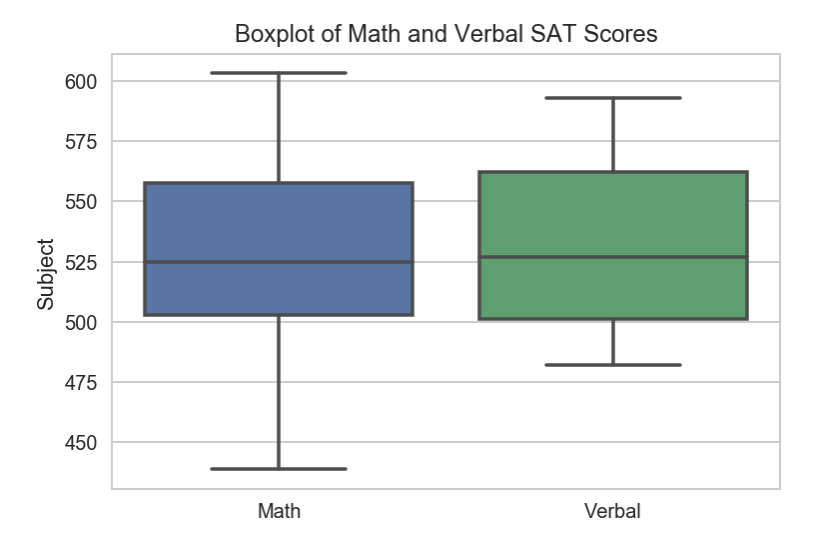
Now let’s create a box plot to view the average scores for Verbal and Math.
Click here to see the full notebook.